Facets: An Open Source Visualization Tool for Machine Learning Training Data
July 17, 2017
Posted by James Wexler, Senior Software Engineer, Google Big Picture Team
(Cross-posted on the Google Open Source Blog)
Getting the best results out of a machine learning (ML) model requires that you truly understand your data. However, ML datasets can contain hundreds of millions of data points, each consisting of hundreds (or even thousands) of features, making it nearly impossible to understand an entire dataset in an intuitive fashion. Visualization can help unlock nuances and insights in large datasets. A picture may be worth a thousand words, but an interactive visualization can be worth even more.
Working with the PAIR initiative, we’ve released Facets, an open source visualization tool to aid in understanding and analyzing ML datasets. Facets consists of two visualizations that allow users to see a holistic picture of their data at different granularities. Get a sense of the shape of each feature of the data using Facets Overview, or explore a set of individual observations using Facets Dive. These visualizations allow you to debug your data which, in machine learning, is as important as debugging your model. They can easily be used inside of Jupyter notebooks or embedded into webpages. In addition to the open source code, we've also created a Facets demo website. This website allows anyone to visualize their own datasets directly in the browser without the need for any software installation or setup, without the data ever leaving your computer.
Facets Overview
Facets Overview automatically gives users a quick understanding of the distribution of values across the features of their datasets. Multiple datasets, such as a training set and a test set, can be compared on the same visualization. Common data issues that can hamper machine learning are pushed to the forefront, such as: unexpected feature values, features with high percentages of missing values, features with unbalanced distributions, and feature distribution skew between datasets.
 |
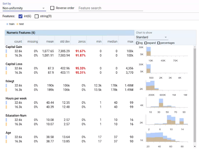
| Facets Overview visualization of the six numeric features of the UCI Census datasets[1]. The features are sorted by non-uniformity, with the feature with the most non-uniform distribution at the top. Numbers in red indicate possible trouble spots, in this case numeric features with a high percentage of values set to 0. The histograms at right allow you to compare the distributions between the training data (blue) and test data (orange). |
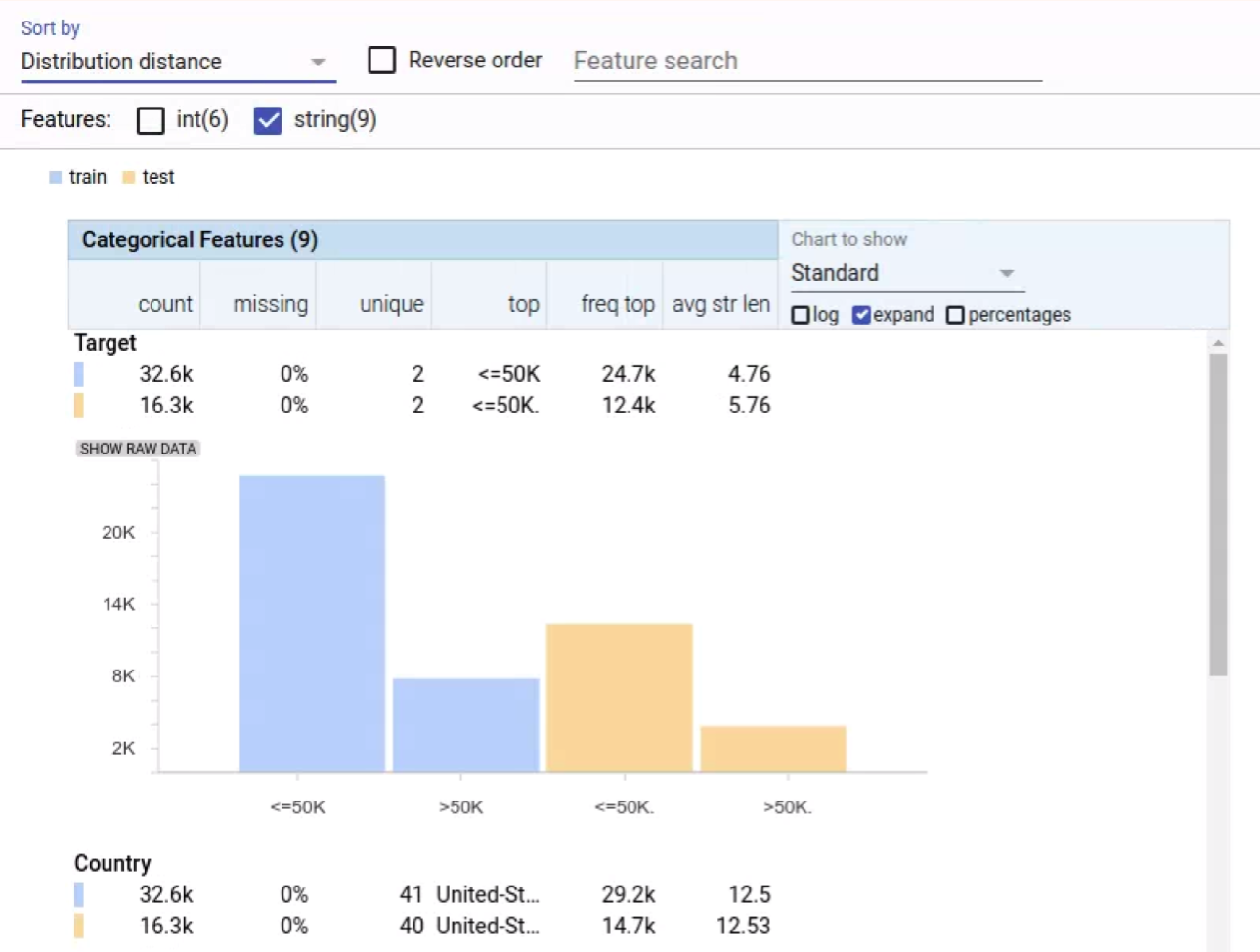 |
| Facets Overview visualization showing two of the nine categorical features of the UCI Census datasets[1]. The features are sorted by distribution distance, with the feature with the biggest skew between the training (blue) and test (orange) datasets at the top. Notice in the “Target” feature that the label values differ between the training and test datasets, due to a trailing period in the test set (“<=50K” vs “<=50K.”). This can be seen in the chart for the feature and also in the entries in the “top” column of the table. This label mismatch would cause a model trained and tested on this data to not be evaluated correctly. |
Facets Dive provides an easy-to-customize, intuitive interface for exploring the relationship between the data points across the different features of a dataset. With Facets Dive, you control the position, color and visual representation of each data point based on its feature values. If the data points have images associated with them, the images can be used as the visual representations.
 |
| Facets Dive visualization showing all 16281 data points in the UCI Census test dataset[1]. The animation shows a user coloring the data points by one feature (“Relationship”), faceting in one dimension by a continuous feature (“Age”) and then faceting in another dimension by a discrete feature (“Marital Status”). |
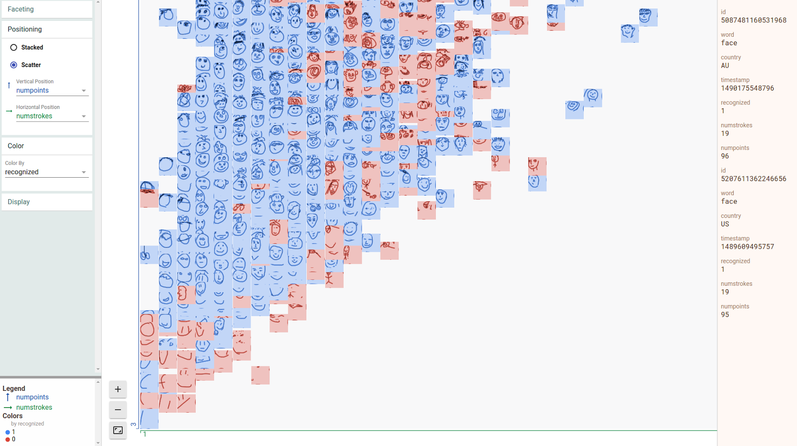 |
| Facets Dive visualization of a large number of face drawings from the “Quick, Draw!” Dataset, showing the relationship between the number of strokes and points in the drawings and the ability for the “Quick, Draw!” classifier to correctly categorize them as faces. |
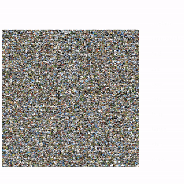 |
| Exploration of the CIFAR-10 dataset using Facets Dive. Here we facet the ground truth labels by row and the predicted labels by column. This produces a confusion matrix view, allowing us to drill into particular kinds of misclassifications. In this particular case, the ML model incorrectly labels some small percentage of true cats as frogs. The interesting thing we find by putting the real images in the confusion matrix is that one of these "true cats" that the model predicted was a frog is actually a frog from visual inspection. With Facets Dive, we can determine that this one misclassification wasn't a true misclassification of the model, but instead incorrectly labeled data in the dataset. |
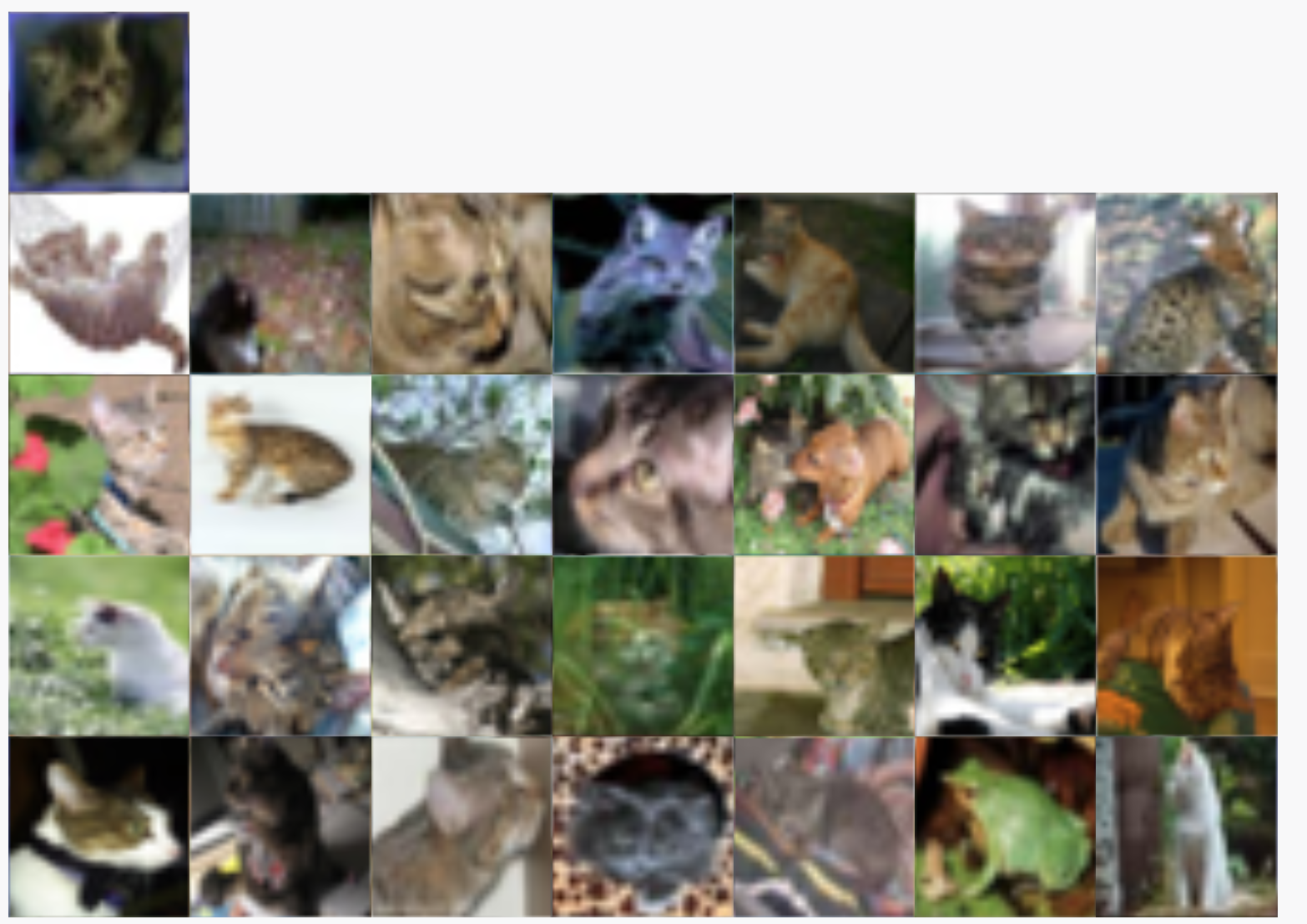 |
| Can you spot the frog-cat? |
We’ve gotten great value out of Facets inside of Google and are excited to share the visualizations with the world. We hope they can help you discover new and interesting things about your data that lead you to create more powerful and accurate machine learning models. And since they are open source, you can customize the visualizations for your specific needs or contribute to the project to help us all better understand our data. If you have feedback about your experience with Facets, please let us know what you think.
Acknowledgments
This work is a collaboration between Mahima Pushkarna, James Wexler and Jimbo Wilson, with input from the entire Big Picture team. We would also like to thank Justine Tunney for providing us with the build tooling.
References
[1] Lichman, M. (2013). UCI Machine Learning Repository [http://archive.ics.uci.edu/ml/datasets/Census+Income]. Irvine, CA: University of California, School of Information and Computer Science
[2] Learning Multiple Layers of Features from Tiny Images, Alex Krizhevsky, 2009.
Other posts of interest
-
April 12, 2024
Contrastive neural audio separation- Machine Intelligence ·
- Sound & Accoustics
-
April 11, 2024
Patchscopes: A unifying framework for inspecting hidden representations of language models- Machine Intelligence ·
- Natural Language Processing ·
- Responsible AI
-
March 28, 2024
AutoBNN: Probabilistic time series forecasting with compositional bayesian neural networks- Algorithms & Theory ·
- Machine Intelligence ·
- Open Source Models & Datasets